
A comprehensive smart home solution designed specifically for users with visual impairments, featuring voice-first interactions and haptic feedback
Author: John Doe
Keyboard navigation, focus indicators, ARIA labels, semantic HTML, and more. This theme is designed to be inclusive.
35+ components and counting, all tried and tested for the most optimal accessible experience for your visitors.
Fully integrated Dark mode gives your users the choice for their favorite viewing mode.
Use the power of Tailwind to greatly improve your productivity and enhance your developer workflow.
Less worry about formatting your code, let the Astro Prettier integration do the heavy lifting.
Lint your code with strict a11y settings to ensure you stay on track with the WCAG standards.
This theme comes with a fully integrated blog and portfolio, dynamic pages and SEO optimization.
Easily use .md and .mdx pages to build your websites or use it with Netlify CMS.
The theme offers some very handy utilities to help you build your website faster.
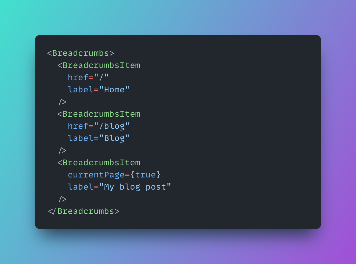
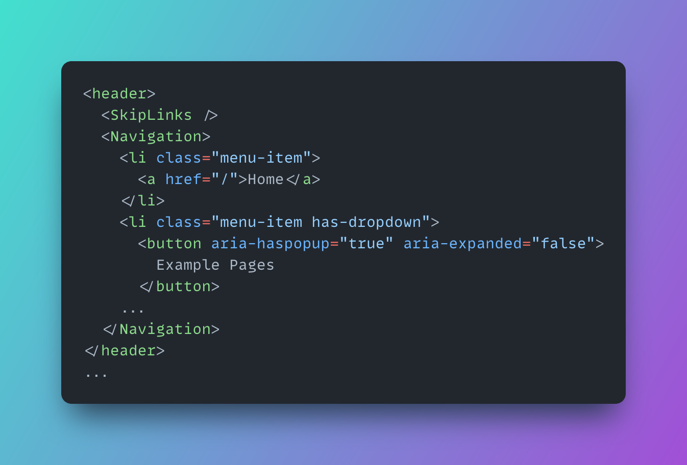
This theme provides plenty of tried and tested Accessible Astro Components. Some are native to this theme and a lot of others are integrated using a separate package Opens in a new tab . They'll get you up and running in building an accessible solution for your visitors.
Using semantic HTML, landmarks, skip links, screen reader friendly content, aria-labels, keyboard accessible navigation and components, clear outlines and tab indicators and the right color contrast, you're more certain of reaching WCAG AA compliance.
A comprehensive smart home solution designed specifically for users with visual impairments, featuring voice-first interactions and haptic feedback
Author: John Doe
An AI-powered real-time sign language translation system that enables seamless communication between deaf and hearing individuals
Author: Jane Smith
A comprehensive web security solution that ensures both robust protection and WCAG 2.1 Level AAA compliance for enterprise websites
Author: Alex Riveraquia et suscipit suscipit recusandae consequuntur expedita et cum reprehenderit molestiae ut ut quas totam nostrum rerum est autem sunt rem eveniet architecto
User ID: 1est rerum tempore vitae sequi sint nihil reprehenderit dolor beatae ea dolores neque fugiat blanditiis voluptate porro vel nihil molestiae ut reiciendis qui aperiam non debitis possimus qui neque nisi nulla
User ID: 1et iusto sed quo iure voluptatem occaecati omnis eligendi aut ad voluptatem doloribus vel accusantium quis pariatur molestiae porro eius odio et labore et velit aut
User ID: 1This section demonstrates how to effectively use the Accordion component to organize and display frequently asked questions in an accessible and user-friendly way.
Contact support teamWCAG (Web Content Accessibility Guidelines) is a set of internationally recognized standards for web accessibility. Following WCAG ensures your website is usable by people with various disabilities, including visual, auditory, physical, and cognitive impairments. It's important not just for accessibility, but also for legal compliance, SEO, and reaching a wider audience.
Alt text is specifically for describing images to screen reader users, while ARIA labels (aria-label, aria-labelledby) can describe any element on a page. Alt text is HTML's native way to provide alternative text for images, while ARIA labels are part of the ARIA specification that helps make dynamic content and advanced UI controls more accessible.
Keyboard navigation is essential for users who can't use a mouse, including people with motor disabilities, visual impairments, or those who simply prefer keyboard controls. A website should be fully operable using only a keyboard, with visible focus indicators and logical tab order. This includes being able to access all interactive elements and navigate through content efficiently.
According to WCAG 2.2 AA standards, text should have a minimum contrast ratio of 4.5:1 against its background for regular text, and 3:1 for large text (18pt or 14pt bold). For non-text elements like icons or buttons, a minimum ratio of 3:1 is required. This ensures content is readable for users with visual impairments or color blindness.
To make custom components accessible, focus on these key aspects: use semantic HTML where possible, implement proper keyboard support, add appropriate ARIA attributes, manage focus when needed, and ensure adequate color contrast. Always test with screen readers and keyboard navigation. Consider using established design patterns from the ARIA Authoring Practices Guide.
We're a community of developers who are passionate about making the web more accessible. We're always looking for new ways to improve the accessibility of the web.
Robert Johnson
Manager
Maria Torres
Developer
Alex Kim
Designer
Sarah Lee
Content Strategist
James Peterson
QA Engineer
Lisa Wong
Product Owner
David Martinez
UX Researcher
Emma Brown
Accessibility Specialist
Thomas Chen
Frontend Developer
1.100+
Stars
On GitHub
35+
Accessible
Components
500+
Commits
Merged
48+
Months
Since launch